GreenLeaf Industries Branding Case Study
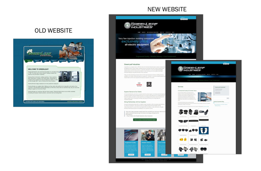
GreenLeaf Industries came to MarketCrest for a branding redesign & website upgrade that included a responsive theme with inbound marketing characteristics.
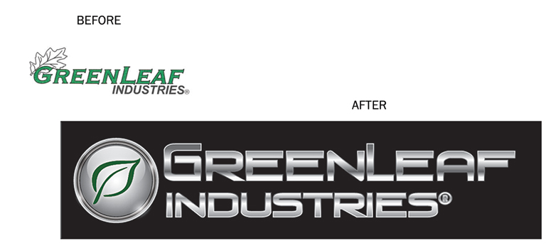
The first phase was to combine industry and competitive research with feedback gleaned from internal strategy sessions to identify their desired position in the market and target client base. We were then able to design branding basics, such as color, style and visual appeal based on targeted personas. It was decided that a broad, hi-tech, industrial look with a “precision” feel would be the most impactful and could be tailored to retain historical, but downplayed elements.
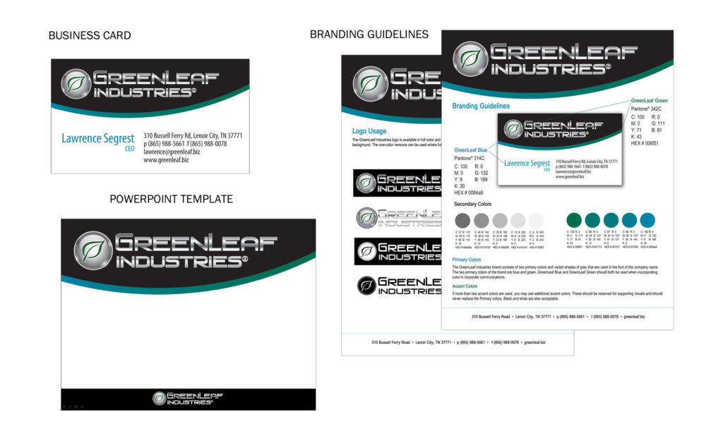
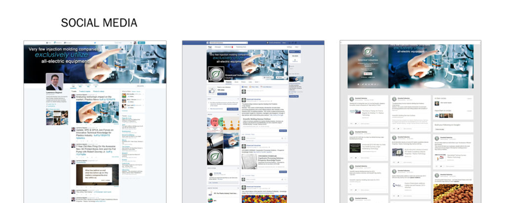
We worked with the management team at GreenLeaf through several rounds of creative design, colors, and fonts to gain the optimal design. Once the main logo was completed, the full set of corporate branding colors, logo versions and usage were finished as well as business cards, letterhead, PowerPoint templates, social media profiles and ultimately the website.
As part of the branding package, we gave them a series of colors they could use for presentations, printed materials and the web.
With the branding in place, we were able to develop a website with a proper user experience that reflected the branding standards, and spoke to the individual personas developed for visitors. In addition to designing and developing the new website, MarketCrest selected images, provided content, copy writing, product photography and corporate messaging.